

Advertisement
By IS Team
The Art of Calligraphy and Typography in Invitations

Advertisement
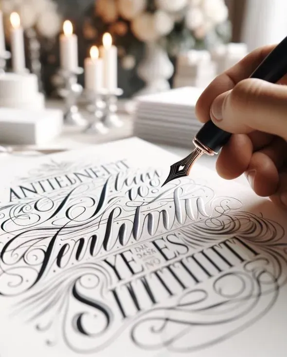
Calligraphy and typography are more than just writing and printing styles; they are the soul of invitation design, setting the stage for the event they announce. The delicate strokes of calligraphy bring a human touch, often reserved for the most formal and heartfelt invitations.
In contrast, typography is the silent ambassador of design, communicating not just through words but through the character of the fonts themselves. From the grandeur of weddings to the cheer of birthday celebrations, the artful use of these elements dictates the first impression an invitation makes.
Wedding Invitations
A. Traditional Calligraphy Styles
Intricate and flowing, traditional calligraphy imparts a sense of heritage and solemnity, often using ink and nib to create graceful lines that are as timeless as the institution of marriage itself.
B. Modern Typography Trends
Bold sans-serifs and unconventional layouts reflect a modern couple's breaking from tradition, with typography that's as forward-thinking as their life together promises to be.
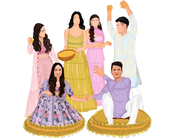
C. Cultural Variations in Calligraphy
Each culture's calligraphy brings its own flavor, from the ornate flourishes of Western scripts to the disciplined beauty of Asian characters, each telling a [unique story of love and union]
(https://www.invitationstreet.com/blog/challenges-of-wedding-invitation-creation).
Advertisement
D. Typography and Readability
The art lies in selecting typefaces that not only look good but also facilitate easy reading, ensuring guests can navigate the details of the event with ease.
E. Case Studies: Examples of Elegant Wedding Invitations
From the royal-inspired scripts to minimalist chic typography, case studies highlight how the art of lettering can set the stage for the big day.
Corporate Event Invitations
A. Branding with Typography The strategic use of corporate typefaces and color schemes in invitations reinforces brand recognition and conveys a message of professionalism.
B. Professional Calligraphy for Formality
Calligraphy can be used to honor tradition and formality, often reserved for the most prestigious events or highest-ranking attendees.
C. Typography and Corporate Identity
The careful selection of fonts and layout in the invitation can mirror the company's ethos, from conservative and reliable to innovative and bold.
D. Case Studies: Corporate Invitations That Stand Out
Examining how some companies have used typography to their advantage, turning a simple invitation into a statement of intent and a reflection of corporate culture.
Birthday Party Invitations
A. Fun and Whimsical Calligraphy
The playful nature of birthday calligraphy often incorporates fun elements like swirls, color splashes, and dynamic strokes that bring the party to life before it even begins.
B. Typography That Reflects Personality
The chosen fonts are as diverse as the people they celebrate, ranging from quirky hand-drawn letters to elegant scripts that speak to the individual's tastes.
C. Age-Appropriate Design Choices
Design elements are tailored not just to the age but to the interests and passions of the birthday person, creating a visual theme that resonates and excites.
D. Case Studies: Creative Birthday Invitations
Showcasing how designers have pushed the envelope, using typography and calligraphy to craft invitations that are as memorable as the birthdays they announce.
Baby Shower Invitations
A. Soft and Gentle Calligraphy Styles The gentle undulation of lines in calligraphy evokes the softness associated with a newborn, with each loop and swirl wrapping the words in a visual lullaby.
B. Typography That Evokes Warmth and Welcome
The typography is often rounded and soft, avoiding harsh lines and angles to create a sense of comfort and approachability.
C. Color and Typography Choices
The selection of hues and fonts is often inspired by nursery themes or the gender of the baby, using visual cues to celebrate the upcoming joy.
D. Case Studies: Memorable Baby Shower Invitations
Real-life examples where the melding of calligraphy and typography has resulted in invitations that are cherished as keepsakes and set the tone for a heartfelt celebration.
Holiday and Seasonal Invitations
A. Calligraphy That Captures the Spirit of the Season
Season-specific calligraphy can range from the icy elegance of winter scripts to the sun-kissed curves of summer letters, each capturing the essence of the season.
B. Typography and Color Schemes for Holidays
The fonts and colors chosen often reflect the traditional palette of the holiday, with a modern twist to keep the invitation fresh and exciting.
C. Balancing Tradition and Innovation
Designers walk the fine line between honoring time-honored traditions and infusing modern design principles to create holiday invitations that are both nostalgic and new.
D. Case Studies: Holiday Invitations with Flair
A showcase of holiday invitations that have successfully used calligraphy and typography to create an atmosphere of celebration and anticipation.
Art Exhibition and Gallery Opening Invitations
A. Artistic Calligraphy as a Reflection of the Event
The calligraphy used in these invitations often takes cues from the art itself, serving as a visual prelude to the style and emotion of the exhibition.
B. Typography That Complements the Art Style
The typography is selected not just for aesthetic harmony but also for its ability to communicate the essence of the art, whether it's bold and abstract or delicate and detailed.
C. The Role of Visual Hierarchy in Typography
The layout of the typography guides the viewer's eye, prioritizing the flow of information from the most important details to the finer points.
D. Case Studies: Invitations That Are Works of Art
Exploring how some invitations stand out as collector's items, with calligraphy and typography that are as thoughtfully curated as the art they announce.
Advertisement
Fundraising and Charity Event Invitations
A. Calligraphy That Conveys Sincerity and Urgency
The handcrafted nature of calligraphy lends a personal touch that can convey the sincerity behind a charitable cause, urging recipients to take notice and action.
B. Typography That Communicates the Cause
The clarity and legibility of the chosen fonts ensure that the message of the cause is communicated effectively, resonating with the ethos of the charity.
C. The Balance Between Aesthetics and Information
The design must strike a balance, providing all necessary event details while also appealing to the emotions and generosity of potential donors.
D. Case Studies: Effective Charity Event Invitations
Analyzing successful charity event invitations that have used the power of typography and calligraphy to inspire and engage a community of supporters.
Graduation Announcements and Invitations
A. Formal Calligraphy for Milestone Celebrations
The formality of the occasion is matched by the elegance of the calligraphy, often incorporating traditional academic symbols and emblems.
B. Typography That Reflects Academic Achievement
The typography conveys a sense of accomplishment and prestige, often using classic typefaces that are associated with academia and success.
C. Incorporating School Colors and Emblems
The design often features the school's colors and emblems prominently, celebrating the graduate's identity and connection to their alma mater.
D. Case Studies: Graduation Invitations That Honor the Graduate
Showcasing standout graduation invitations that have used calligraphy and typography to celebrate the graduate's journey and their step into the future.
Advertisement
Conclusion
The art of calligraphy and the strategic use of typography in invitations are timeless yet ever-evolving. They are the silent narrators of the event's story, setting the tone and inviting guests not just to a location, but to an experience. As we continue to celebrate life's milestones, these art forms adapt, ensuring that every invitation is as unique as the event it heralds and as special as the people it honors.
Advertisement
What Are You Looking For?
Advertisement


I'm Looking For!
Get personalized digital invitations for
weddings, birthdays, and special events.
Unique designs, quality, and exceptional
service to make your celebrations
unforgettable.
Get personalized digital invitations for
weddings, birthdays, and special events.
Unique designs, quality, and exceptional
service to make your celebrations
unforgettable.
Quick Links
Customer Service
Creative Invitation Guides
Supports & Social Media

Get personalized digital invitations for weddings, birthdays, and special events. Unique designs, quality, and exceptional service to make your celebrations unforgettable.
Quick Links
+Customer Service
+Creative Invitation Guides
+CONTACT US
+