

Advertisement
By IS Team
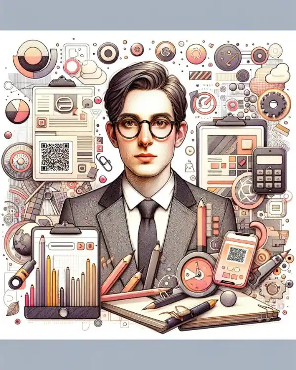
Invitation Calligraphy And Typography For Corporates

Advertisement
At a bustling corporate event planning office, a skilled designer sits down to craft an invitation that captures the essence of an upcoming prestigious gala. With a keen understanding of Invitation Calligraphy and Typography for Corporates, they select an elegant Copperplate script to highlight the event's sophistication and pair it with a crisp serif typeface to ensure the details are both readable and stylish.
The blend of calligraphy and typography not only serves the practical purpose of guiding attendees through the invitation but also communicates the company's brand identity—its commitment to excellence and attention to detail.
This careful integration of artistic elements elevates the invite from a mere announcement to a powerful branding tool, making every recipient feel personally addressed and valued. This story underscores the significant role that calligraphy and typography play in enhancing corporate communications and creating lasting impressions.
Understanding the Basics
Advertisement
Calligraphy and typography are both artistic expressions that revolve around letters and text but differ significantly in their essence and application.
The Essence of Calligraphy and Typography
Here's the content structured in a table format for a clear comparison between the essence of calligraphy and typography:
| Aspect | Calligraphy | Typography |
|---|---|---|
| Definition | The art of writing beautifully. | The technique of arranging type. |
| Expression | Deeply personal, each stroke is unique and reflects the artist's hand. | Processed textual content aimed at making written language legible, readable, and visually appealing. |
| Characteristics | Elegant, flowing forms of letters. Infused with the nuances of the artist's hand. | Involves selecting typefaces, point sizes, line lengths, line-spacing (leading), letter-spacing (tracking), and kerning. |
| Application | Traditionally used in hand-written letters, official documents, and artistic pieces. | Used in multiples, whether in print or on screen, crucial for branding, advertising, and creating visual appeal in published media. |
| Focus | Personal touch and artistic expression. | Legibility, readability, and visual appeal in mass reproduction. |
This table effectively encapsulates the key distinctions and focuses of calligraphy and typography, highlighting how each plays a unique role in written communication and artistic expression.
Key Terms and Concepts
- Font
- A set of displayable text characters in a specific style and size.
- Typeface
- Often used interchangeably with font, a typeface is actually the design of the lettering that can be composed of many fonts (regular, bold, italic, etc.).
- Script
- In typography, script fonts mimic handwriting, offering an informal or decorative style crafted from the fluid stroke of calligraphy.
- In typography, script fonts mimic handwriting, offering an informal or decorative style crafted from the fluid stroke of calligraphy.
By understanding these distinctions and historical contexts, businesses can more effectively decide how to incorporate these artistic elements into their branding strategy. Whether through the elegance of calligraphy or the precision of typography, each technique offers a unique way to enhance corporate communications, making them an integral part of a brand’s identity.
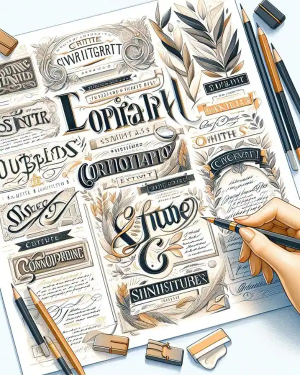
Design Principles in Typography
Advertisement
Typography Fundamentals
Mastering the fundamentals of typography is crucial for creating engaging and effective corporate communications. Here's how these principles shape every piece of written communication:
- Contrast: This principle ensures that text stands out where it should, using bold or italic variations to create a dynamic hierarchy.
- Balance: Achieving visual balance makes the content pleasant to look at, using symmetrical or asymmetrical layouts to distribute text evenly.
- Hierarchy: Essential for guiding the reader's eye through the information, hierarchy is established through varying font sizes, colors, and weights.
- Alignment: Proper alignment, whether it’s left, right, centered, or justified, ensures a tidy, organized appearance that respects the overall design structure.
- Consistency: Maintaining a consistent style throughout your document reinforces brand identity and aids in overall comprehension.
Choosing the Right Typeface for Corporate Invitations
Selecting the right typeface is more than just picking fonts; it's about making a statement. Here’s how to choose wisely:
Here's the content structured in a table format for selecting the right typeface for corporate invitations:
| Typeface Choice | Features | Ideal Usage |
|---|---|---|
| Serif | Classic decorative details | Perfect for formal events, conveying tradition and reliability |
| Sans Serif | Clean and modern look | Suitable for more contemporary and informal gatherings |
| Contemporary | Fresh, modern vibe | Aligns with modern branding and less formal events |
| Classic Styles | Reflects stability and respectability | Ideal for traditional, prestigious corporate events |
Legibility and Readability in Typography
The ultimate goal of typography is not just to decorate but to make text easy to read and understand:
- Legibility refers to how easily individual characters can be distinguished from each other. This is crucial in print materials where font size and spacing can significantly impact clarity.
- Readability involves how blocks of text are arranged on a page, affecting how easily the text can be scanned and understood by the reader.
Calligraphy Styles for Corporate Invitations
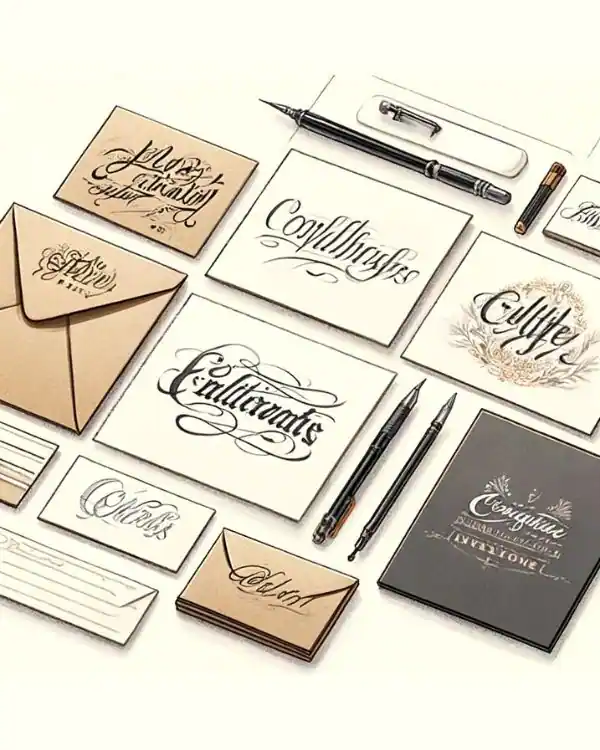
Popular Calligraphy Styles Suitable for Corporates
When it comes to crafting an invitation that speaks volumes about your company’s ethos and aesthetic, choosing the right calligraphy style is crucial. Here are some popular styles that resonate well within corporate environments:
- Copperplate: Known for its elegant and fluid strokes, Copperplate calligraphy exudes a sense of formality and sophistication. This style is perfect for high-profile corporate galas or any event where a touch of classical elegance is desired.
- Italic: With its slanted and more relaxed appearance, Italic calligraphy offers a balanced blend of formality and modernity. It’s versatile enough for both official gatherings and less formal corporate events.
- Modern Script: Dynamic and expressive, Modern Script brings a contemporary flair with its free-flowing and less structured forms. It’s ideal for companies looking to project a youthful and innovative image.
Choosing a Style That Reflects the Corporate Identity
Selecting a calligraphy style isn't just about aesthetics; it's about finding a visual representation of your company’s identity. Consider the brand’s values, the nature of the event, and the expected audience. A luxury brand might lean towards Copperplate for its opulence, while a tech startup might prefer the freshness of Modern Script.
Integrating Brand Colors and Elements into Calligraphy
To further tailor your invitations to reflect your brand, incorporate your company’s colors and graphical elements into the calligraphy design. This could mean using brand colors for the ink or including a small logo or motif that echoes your corporate identity. This integration ensures the invitation is not just seen as a piece of information but as an extension of your brand experience.
By thoughtfully selecting and designing calligraphy styles for your corporate invitations, you create more than just an invite—you craft a memorable first impression that carries the essence of your brand.
Application of Calligraphy and Typography in Corporate Invitations
Analysis of Different Types of Corporate Events
Corporate events can vary greatly in tone and formality, and the design of invitations should reflect the nature of each event to set the right expectations:
- Formal Events (e.g., Galas, Award Ceremonies): These events usually require a refined and elegant touch. Calligraphy like Copperplate or a serif typeface can convey the formality and exclusivity of the occasion. Use of high-quality paper and a classic color scheme enhances the sophistication.
- Informal Events (e.g., Team Outings, Company Picnics): For more relaxed events, a casual and approachable design is suitable. Modern Script calligraphy or a sans serif typeface can give invitations a friendly and inviting look. Bright colors and fun graphics can add to the casual vibe.
Tips for Blending Calligraphy and Typography in a Single Design
- Harmony and Contrast: Choose a calligraphy style and a typeface that complement each other. For instance, a delicate script with a strong, simple serif can create an appealing contrast.
- Hierarchy: Use calligraphy for key elements like the event title or host's name to add emphasis, while typography handles the bulk of the details, ensuring readability.
- Color Coordination: Coordinate the colors used in both calligraphy and typography to unify the design. This doesn’t mean they have to be the same color, but they should be harmonious.
- Consistency with Branding: Ensure that both the selected calligraphy and typography align with the company’s branding. This maintains a consistent brand voice across all materials.
- Simplicity: While blending styles, keep the overall design simple to avoid visual clutter. The goal is to enhance the invitation's appeal without overwhelming the message.
Applying these design principles to corporate invitations using both calligraphy and typography can significantly enhance the perceived value of your events, making them memorable and aligned with your brand's identity.
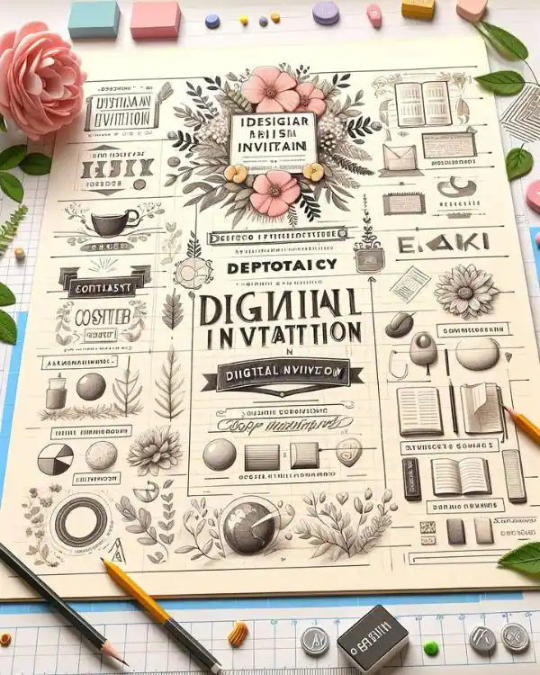
Trends and Innovations in Corporate Invitation Design
Emerging Trends in Corporate Invitation Design
The landscape of corporate invitation design is constantly evolving, with new trends emerging to capture the attention of recipients and reflect modern aesthetics and technologies:
- Eco-Friendly Materials: Sustainability is becoming increasingly important. Many companies are choosing invitations made from recycled materials or opting for digital invitations to minimize environmental impact.
- Minimalist Design: Simplicity is key in modern design. Sleek, clean lines with bold typography and minimal color palettes are trending, allowing the message to take center stage while maintaining elegance.
- Mixed Media Elements: Incorporating unusual materials such as metals, acrylic, or wood into invitations can create a memorable tactile experience that recipients are unlikely to forget.
- Personalization: Advanced printing techniques allow for high levels of customization, such as names printed directly on each invitation, which adds a personal touch and increases engagement.
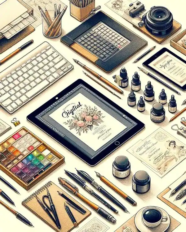
The Future of Digital Invitations and Virtual Event Considerations
As the world becomes increasingly digital, the role of invitations is also shifting:
- Digital Invitations: More companies are adopting digital invitations due to their cost-effectiveness and instant deliverability. These can include animated elements, links to additional information, or RSVP features.
- Virtual Event Platforms: With the rise of virtual events, invitations now often come with links to online platforms where the event will be hosted. They might include instructions for participation, agenda items, or interactive elements to engage attendees beforehand.
- Augmented Reality (AR) Invitations: Some cutting-edge invitations incorporate AR, allowing recipients to view interactive 3D models or messages through their smartphone cameras, providing a unique and engaging experience.
Innovations in Interactive and Multimedia Invitations
Innovation in invitation design is not just about looking good—it's about creating an experience and building anticipation for the event:
- Interactive Elements: Invitations can include QR codes that lead to a video message from the host or interactive websites with more details about the event. Such elements make the invitation a dynamic part of the event experience.
- Video Invitations: These can be especially powerful for setting the tone of the event. A well-produced video can convey more emotion and information than traditional printed text.
- Integrated Social Features: Invitations may include functionalities that allow guests to see who else is attending, engage in pre-event discussions, or share the event on social media.
These trends and innovations in corporate invitation design not only make the invitations more appealing but also more functional, enhancing the overall experience and effectiveness of corporate communications.
Advertisement
Frequently Asked Questions
Q1. How does the choice of calligraphy and typography impact the cost of corporate invitations?
The selection of specific calligraphy styles or custom typography can influence the overall cost due to factors like specialized printing techniques and the time required for detailed handwork or digital design.
Q2. Can calligraphy and typography reflect a company's commitment to diversity and inclusion?
Yes, by choosing typefaces and calligraphy styles that are inclusive, such as easy-to-read fonts for visually impaired attendees or culturally respectful scripts, companies can reflect their commitment to diversity and inclusion.
Q3. What are the risks of over-designing a corporate invitation?
Over-designing can clutter the invitation, detracting from the essential information and potentially confusing the recipients. It's important to balance aesthetic elements with clarity and simplicity.
Q4. How often should a company update its invitation design style to stay modern? Companies should consider refreshing their invitation design every few years or when undergoing a rebranding to ensure the design remains current and aligns with the latest branding and aesthetic trends.
Advertisement
What Are You Looking For?
Advertisement


I'm Looking For!
Get personalized digital invitations for
weddings, birthdays, and special events.
Unique designs, quality, and exceptional
service to make your celebrations
unforgettable.
Get personalized digital invitations for
weddings, birthdays, and special events.
Unique designs, quality, and exceptional
service to make your celebrations
unforgettable.
Quick Links
Customer Service
Creative Invitation Guides
Supports & Social Media

Get personalized digital invitations for weddings, birthdays, and special events. Unique designs, quality, and exceptional service to make your celebrations unforgettable.
Quick Links
+Customer Service
+Creative Invitation Guides
+CONTACT US
+