

Advertisement
By IS Team
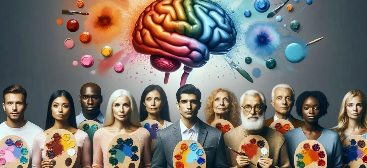
Colorful Minds: The Psychology Behind Invitation Palettes
Advertisement
Colors are more than just visual elements; they're powerful storytellers that evoke emotions, set moods, and create lasting impressions. In the world of invitations, the choice of color can transform a simple card into a memorable keepsake, setting the tone for the event it heralds.
Whether it's the passionate red of a romantic wedding invite or the calming blue of a corporate event card, the psychology behind color choices plays a pivotal role in how an invitation is perceived. Dive into this guide to unravel the mysteries of color psychology in invitations and discover how to harness its power to captivate and resonate with your audience.
The Science Behind Color Psychology
Biological Impact: Colors trigger specific emotions. For instance, blue evokes calmness, making it ideal for formal events, while red can spark excitement, suitable for vibrant celebrations.
Cultural Nuances: Colors carry meanings across cultures. In the West, white might be perfect for weddings, but in some Eastern cultures, it's linked to mourning.
Blue for Trust: Studies suggest blue invitations can convey reliability and trust, setting a serene tone for the event.
Red for Passion: Red invitations can evoke strong emotions, making them ideal for romantic or grand events.
Green for Fresh Starts: Symbolizing growth and tranquility, green is apt for new beginnings, like housewarmings or baby showers.
Yellow for Joy: While cheerful, yellow should be used judiciously in invitations as it can be intense for some.
The Emotional Spectrum of Colors
Red: Often associated with passion, love, and energy, red can also signify danger or urgency. In the context of invitations, it can be perfect for romantic events or grand celebrations.
Blue: A versatile color, blue can represent calmness, trust, and stability. It's a favorite for corporate events or serene occasions like baby showers.
Green: Symbolizing nature, health, and renewal, green can be used for eco-friendly events or celebrations during spring.
Pink: A color that exudes tenderness, romance, and femininity. Ideal for weddings, anniversaries, or baby showers.
White: Representing purity, peace, and simplicity, white is a classic choice for formal events and weddings.
Gold/Silver: These metallic hues convey luxury, sophistication, and exclusivity, making them perfect for grand events and celebrations.
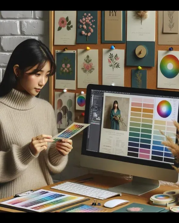
Using Colors in Invitation Design
The art of invitation design goes beyond aesthetics; it's about communicating the essence of an event. The color palette chosen can set expectations, convey the mood, and even hint at the formality of the occasion. Here are some examples to illustrate the impact of color choices:
Elegant White & Gold: Perfect for a "50th wedding anniversary", this combination exudes sophistication and celebrates a golden milestone.
Vibrant Turquoise & Coral: Ideal for a "beach-themed wedding", these colors capture the essence of the sea and the warmth of the sun.
Pastel Pink & Mint: A "baby shower invitation" in these hues sets a soft, nurturing tone, perfect for welcoming a new life.
Royal Blue & Silver: For a "corporate event or gala", this combo communicates professionalism with a touch of luxury.
Earthy Greens & Browns: An "eco-friendly event or a nature-themed gathering" would benefit from these grounding colors, symbolizing sustainability and growth.
Bold Black & Red: For a "grand ballroom event or a formal evening soiree", this powerful duo speaks of elegance and drama.
Soft Lavender & Cream: "Bridal showers or spring events" can adopt this palette for a touch of romance and freshness.
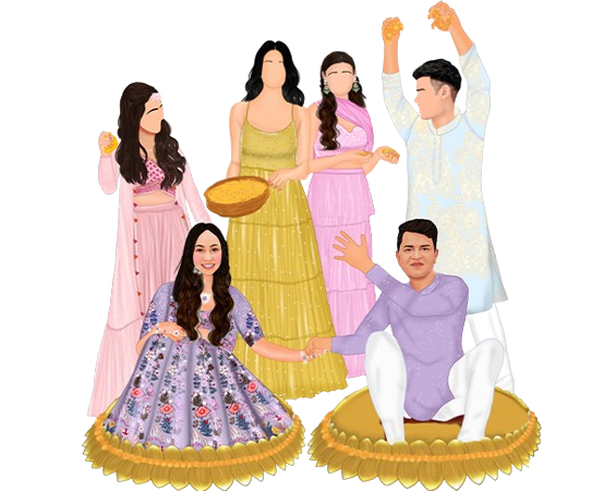
Golden Yellow & Deep Purple: An "Indian wedding" might use these regal colors, representing prosperity and passion.
Rustic Olive & Beige: For a "vineyard wedding or a wine tasting event", these colors capture the rustic charm of the countryside.
Neon Pink & Electric Blue: Indicating a "retro-themed party or an 80s disco night", these colors promise a night of fun and nostalgia.
How to Choose the Right Colors for Your Invitation
Selecting the Perfect Palette for Your Invite-
In the ever-evolving realm of design, staying updated is key. Scout competitor trends, but craft your distinct style. Dive into color psychology to resonate with your audience's emotions. Remember, a hue that's celebratory in one culture might be somber in another. And while creativity is king, consistency across your design elements ensures a polished finish.
Tips for Choosing the Right Colors for Your Invitations
Know Your Audience: Understand the preferences of your target audience. For instance, millennials might prefer modern and chic designs, while an older generation might lean towards classic styles.
Seasonal Colors: Align your color choices with the season of the event. Pastels for spring, brights for summer, warm tones for autumn, and cool colors for winter can be ideal.
| Color | Western Association | Eastern Association |
|---|---|---|
| White | Purity, Peace | Mourning |
| Red | Passion, Danger | Luck, Prosperity |
| Green | Nature, Growth | Eternity, Family |
| Blue | Calm, Trust | Immortality |
| Yellow | Joy, Optimism | Imperial, Noble |
Advanced Tips for Designers
Contrast is Key: Ensure readability by using contrasting colors for the background and text.
Stay Updated: Keep an eye on design trends. What's in vogue today might be passé tomorrow.
Limit Your Palette: While it's tempting to use many colors, a limited palette often looks more cohesive and professional.
Types of Color Schemes
Monochromatic: Single color with varied shades and tints.
Analogous: Neighboring colors on the wheel, harmonious.
Complementary: Opposite colors, offering high contrast.
Split-Complementary: One base plus two adjacent to its complement.
Triadic: Three evenly spaced colors, vibrant and lively.
Tetradic: Two complementary pairs, rich in variation.
Square: Four evenly spaced colors, balanced yet colorful.
Rectangular: Two complementary pairs, similar to tetradic but with different spacing.
Neutral: No hues, just blacks, whites, and grays.
Achromatic: Black, white, and grays only, no color.
Warm: Reds, oranges, yellows, cozy and inviting.
Cool: Blues, greens, purples, calm and soothing.
Pastel: Pale tones, soft and light by adding white.
Real-world Examples
Brands like Tiffany & Co. with their iconic blue or McDonald's with their recognizable red and yellow showcase the power of color in branding. Similarly, in the realm of invitations, a unique color palette can make an invite stand out and be memorable.
Facts and Survey Results
Colors play a pivotal role in shaping our emotions and perceptions. The renowned artist Pablo Picasso once remarked, "Colors, like features, follow the changes of the emotions." This sentiment is echoed in surveys where a significant 68% of respondents associate the passionate hue of red with love.
In contrast, a cheerful 52% relate the bright shade of yellow with joy. However, it's essential to approach color psychology with a discerning eye. Zena O'Connor, a respected faculty member at the University of Sydney, points out that many assertions in this field might lack concrete empirical backing, sometimes blurring the line between genuine facts and mere factoids.
Frequently Asked Questions
Q1: How can I choose the right color for my event's theme?
Answer: Begin by understanding the mood and essence you wish to convey. For instance, if you're hosting a gala, luxurious colors like golds and blacks might be apt. For a beach party, shades of blue and sandy hues can set the right tone. Always consider the event's nature and the emotions you want to evoke in your invites.
Q2: Are there any colors I should avoid in invitation design?
Answer: While there's no strict rule, it's essential to be aware of cultural nuances. For instance, while white signifies purity and peace in Western cultures, it's often associated with mourning in many Eastern cultures. Also, overly bright neon colors might be hard on the eyes and detract from the invitation's information.
Q3: What are the most popular colors for wedding invitations?
Answer: Popular colors for wedding invitations often include pastel shades like blush pink, lavender, and mint green. Classic colors like white, gold, and navy blue also remain timeless favorites. However, the best color is one that resonates with the couple's personality and the wedding's theme.
Q4: What are the best colors for invitations to children's events?
Answer: For children's events, vibrant and playful colors like bright blues, pinks, yellows, and greens are popular choices. These colors exude energy, fun, and excitement, perfectly capturing the essence of children's events.
Q5: What are some tips for using color in a formal invitation?
Answer: For formal invitations, it's best to stick to a muted and elegant color palette. Colors like black, navy blue, deep purples, and rich maroons exude sophistication. Metallic shades like gold, silver, and rose gold can add a touch of luxury.
Q6: What are some tips for using color in an informal invitation?
Answer: Informal invitations allow for more creativity and experimentation. Bright colors, fun patterns, and even neon shades can be explored. The key is to ensure the colors reflect the event's casual and fun nature.
Q7: How can I use color to create a unique and memorable invitation?
Answer: To create a standout invitation, consider using unexpected color combinations or incorporating gradient hues. Metallic foils, holographic effects, or even color-changing inks can add a unique touch. Remember, while being creative, ensure the invitation remains legible and the information is not overshadowed by the design.
Conclusion
Understanding the psychology of colors and their impact on human emotions is crucial for designers. The right color palette can set the tone for an event, evoke desired emotions, and make an invitation truly memorable. As artists and designers, harnessing this knowledge can elevate your creations, ensuring they resonate with the intended audience and stand out in a sea of ordinary invites.
Advertisement
What Are You Looking For?
Advertisement
.png)
.png)
.png)
I'm Looking For!
Get personalized digital invitations for
weddings, birthdays, and special events.
Unique designs, quality, and exceptional
service to make your celebrations
unforgettable.
Get personalized digital invitations for
weddings, birthdays, and special events.
Unique designs, quality, and exceptional
service to make your celebrations
unforgettable.
Quick Links
Customer Service
Creative Invitation Guides
Supports & Social Media

Get personalized digital invitations for weddings, birthdays, and special events. Unique designs, quality, and exceptional service to make your celebrations unforgettable.
Quick Links
+Customer Service
+Creative Invitation Guides
+CONTACT US
+